That time I built a Web App for Field Auditing
A Field Auditor is a person who visits franchise locations and checks for things like brand compliance, cleanliness, facility upkeep, etc.
We had built a web app for this before, but the time had come to make it good.
Working from a previous version
This project was a complete overhaul of a “minimum viable product” iteration (the MVP) we developed at Benchmark Intelligence, a startup I co-founded. The MVP was built using AngularJS (i.e. Angular 1), had basic functionality and was becoming a pain point for our customers.
Benefits of the MVP version.
- We initially built it very quickly.
- Our customers used it successfully for over a year.
- We gained lots of user feedback that we could use to do a better job on the next go around.
Pain points of the MVP version.
- Poor error/success messaging.
- Somewhat poor navigation.
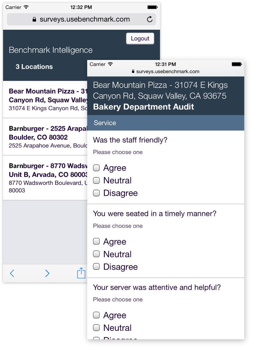
- Refreshing would cause the user to lose survey progress. This is a pretty big challenge as connectivity in the field wasn't always reliable.
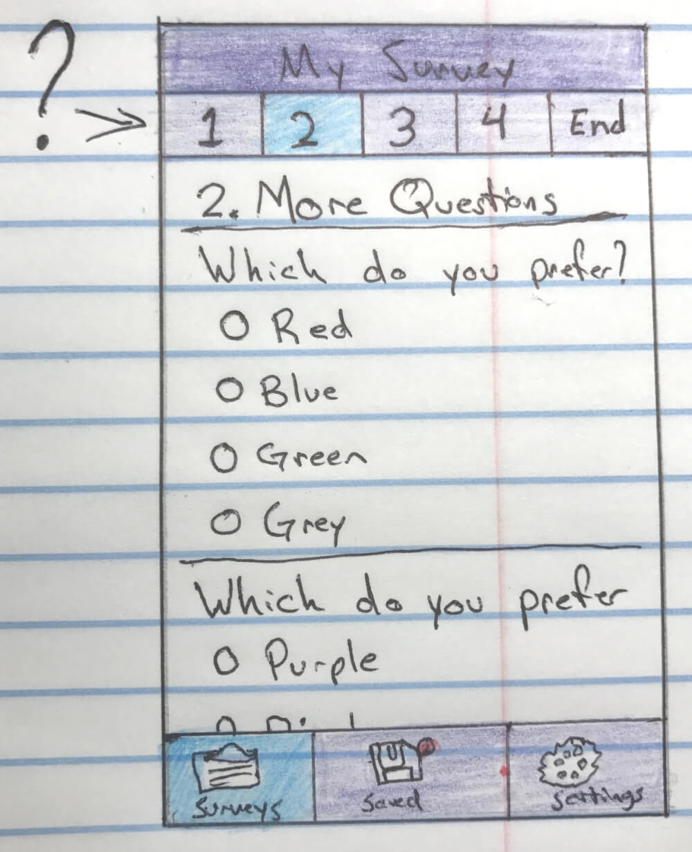
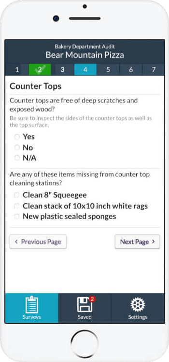
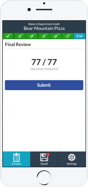
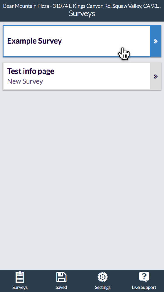
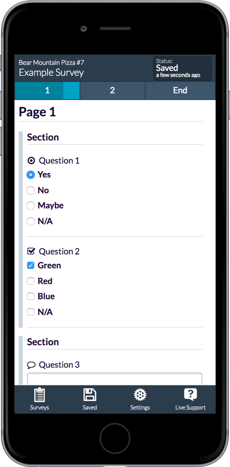
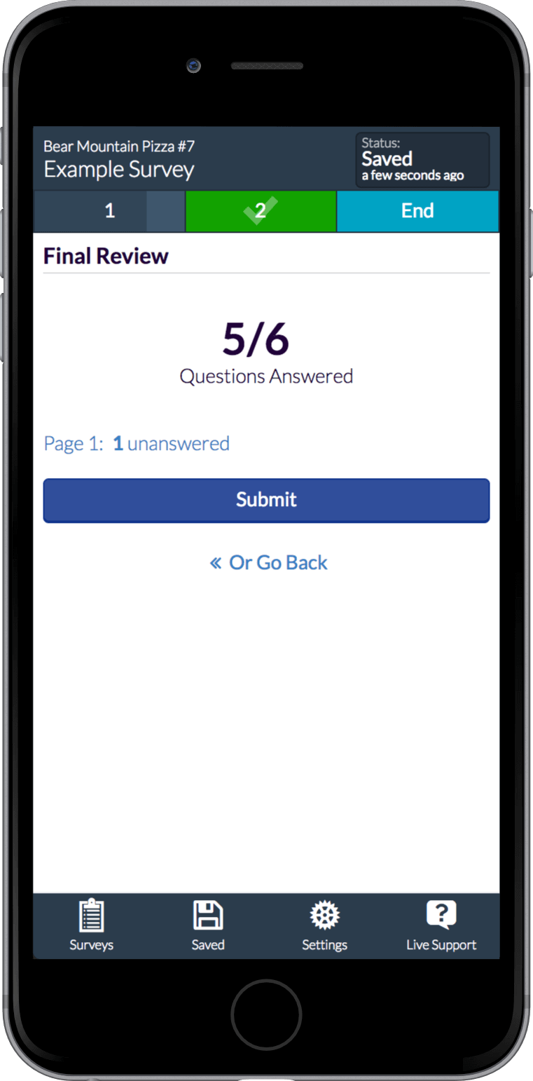
- Poor survey page navigation. It was very hard to know how far along in a survey you were, how many pages there were, if you completed all the pages, etc. It basically required the user to scroll to the bottom of a page to navigate forward and backwards.
My role and considerations before redesign.
My role in this project was the sole designer and majority front end developer. Ken Koontz, a full stack developer and co-founder at Benchmark Intelligence, was focusing on back end engineering for other features, so I wanted to avoid the need for too much back end modification. Rocky Garcia, a full stack developer, made contributions but was mostly occupied with new features on the main Benchmark Intelligence dashboard application.
Refactoring an app at a small startup is only possible with careful timing, strong will and the gracious support from teammates to grant you the time while continuing to push important features and remaining responsive to customer needs.
The Hit List
When approaching the redesign there were a few key functionalities that I knew we needed to improve or incorporate.
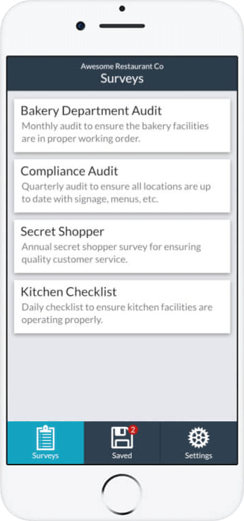
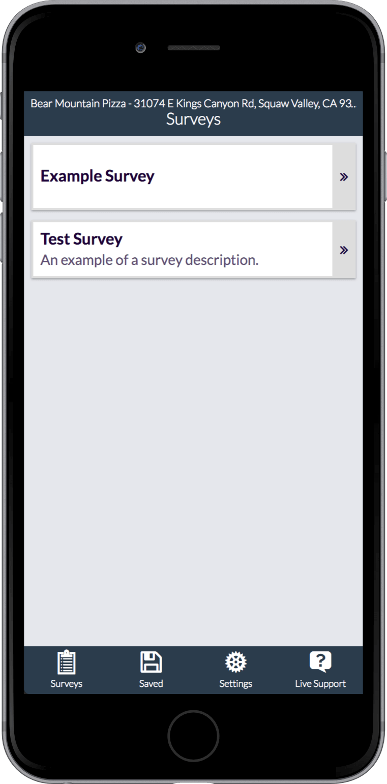
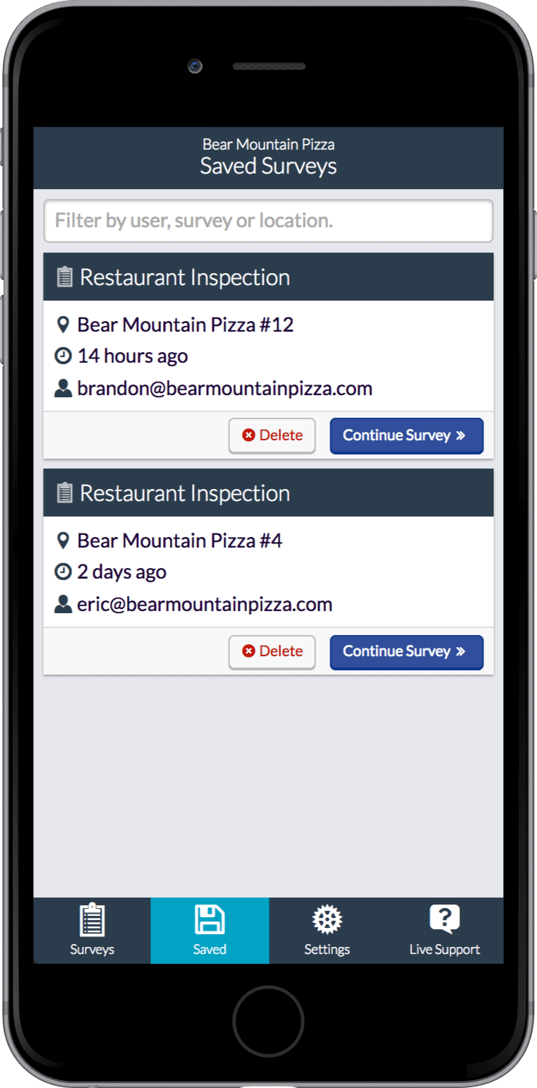
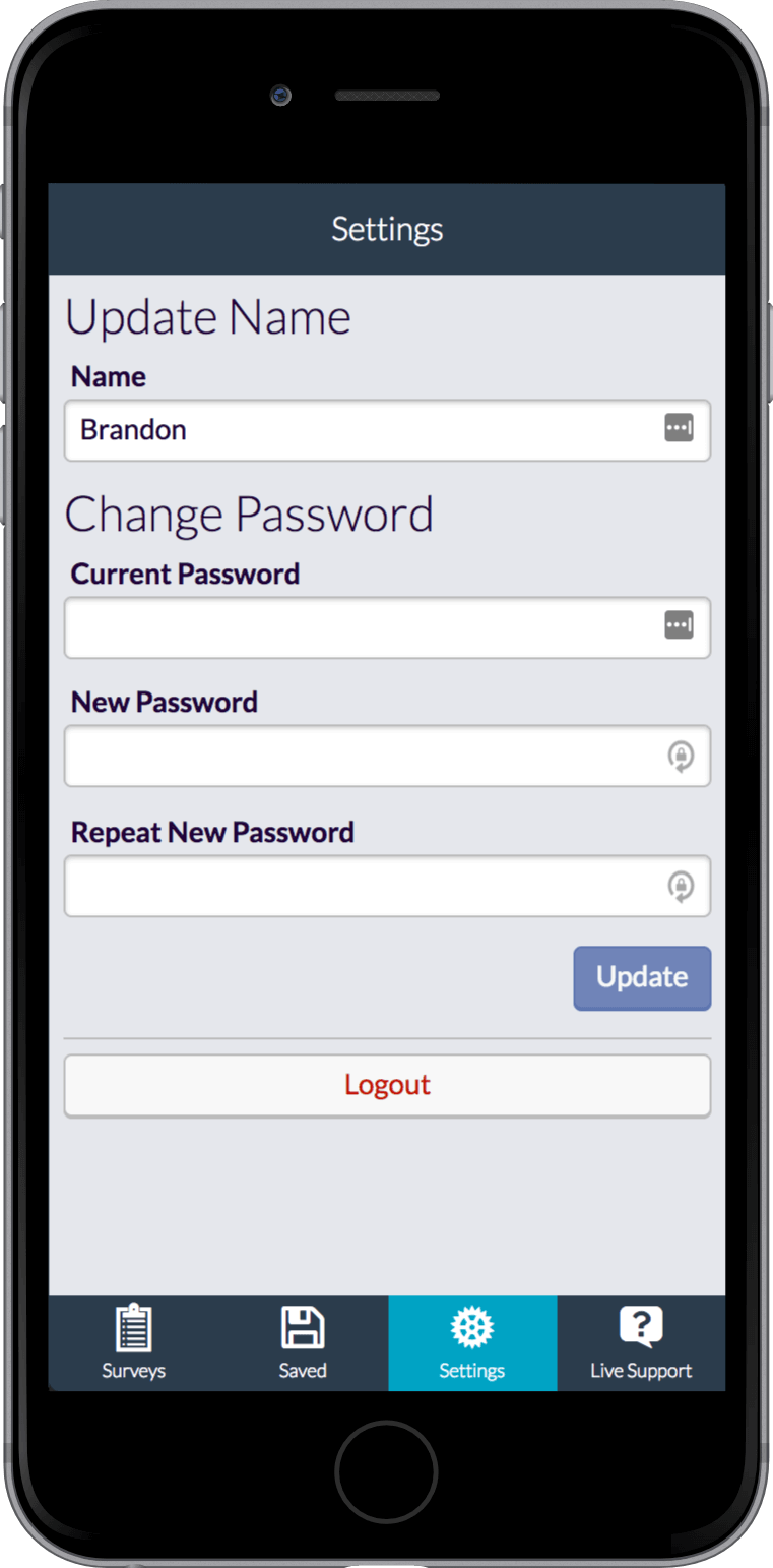
- Restructure Navigation – Make "saved survey progress" more accessible and add basic settings for name and password management.
- Better Error/Success Notifications – Much better communication to the user regarding errors, processes running, connection status, etc.
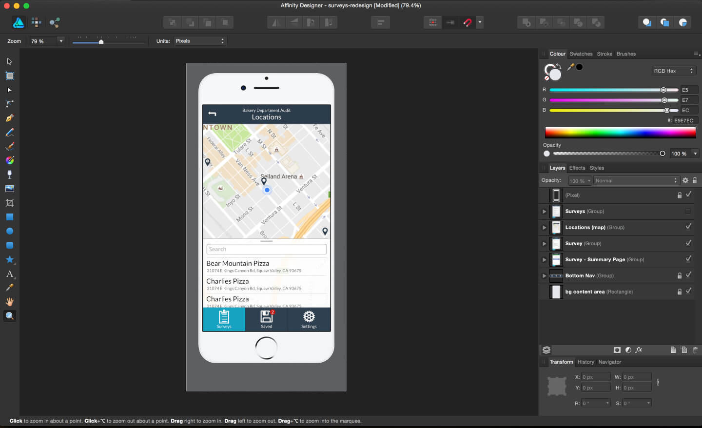
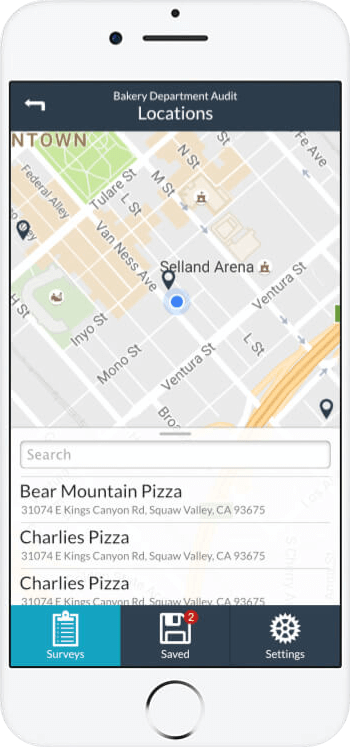
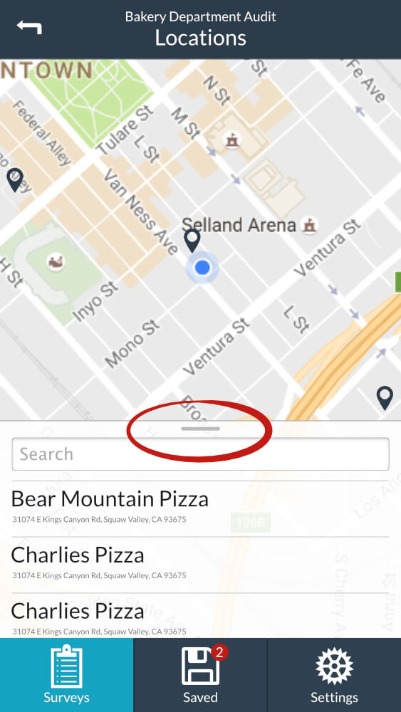
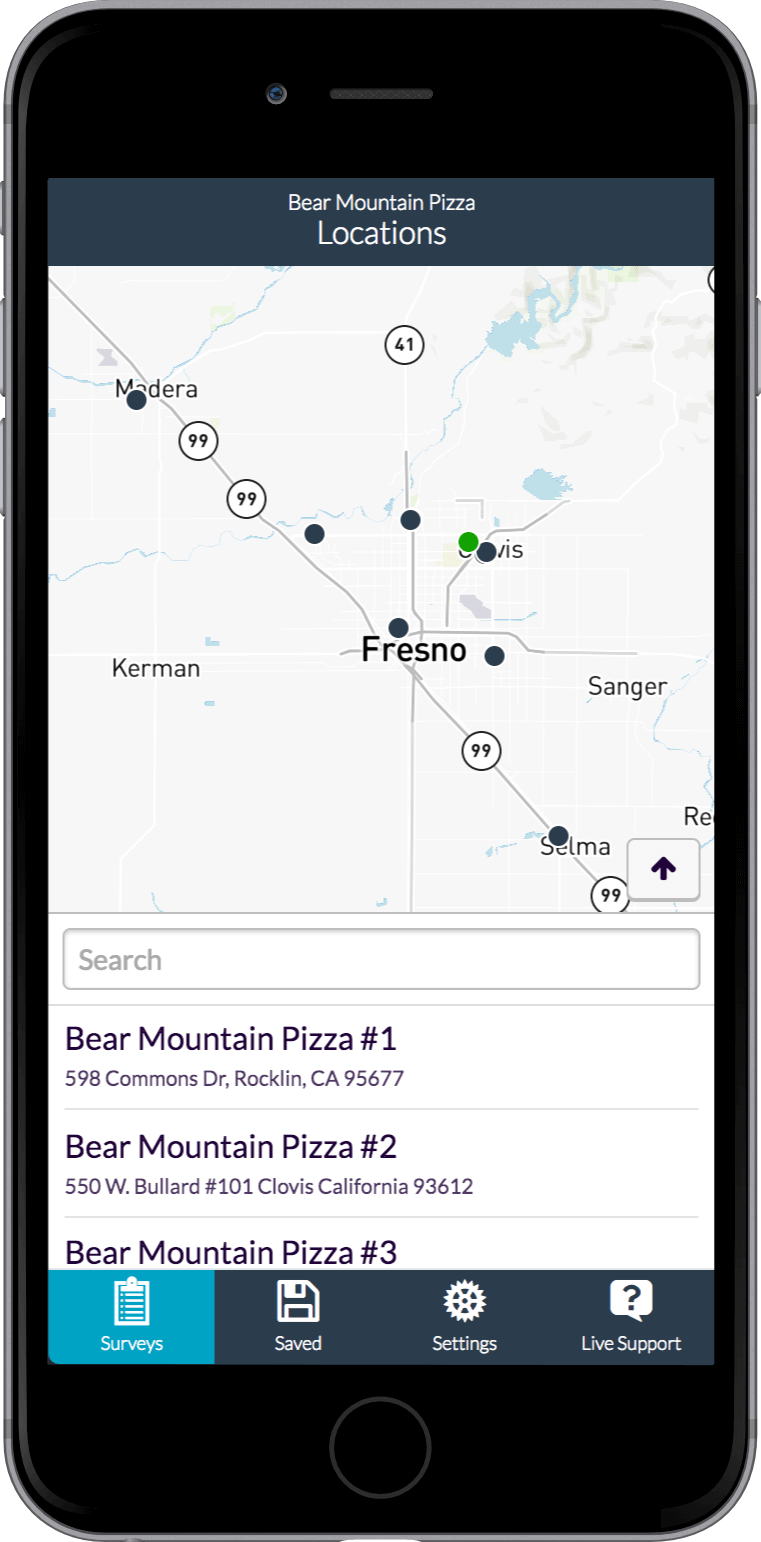
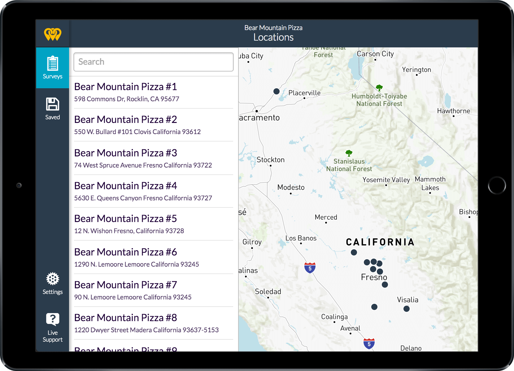
- Add a Map – Location names and addresses can be difficult to remember, sometimes forcing the user out of the app to find a reference. A map would allow them to select the location they’re closest to or otherwise visually select it.
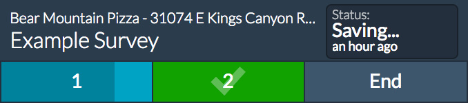
- Better Survey Navigation – Users often need to jump between pages, sometimes leaving them partially complete. I wanted to design something that would make traversing pages easier and at the same time inform them of the completion status of each page as they go.
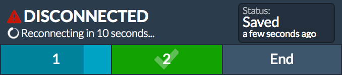
- Automatically Save Survey Progress – In the MVP, a user's progress could be wiped out by a reload. A devastating experience when working with large surveys. When users are in the field, internet connection can be spotty at times, making the risks of a reload very prevalent.
Designing
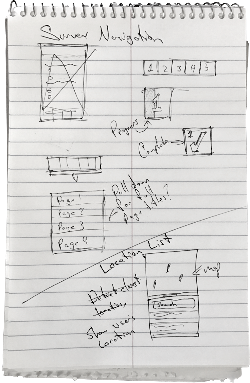
After some initial sketches it was off to the races in my design software. Typically I'd spend a lot more time wire-framing and user testing before drafting a polished design, but because the environment was a fast paced startup, things were a little different.
I did run some "gorilla" UX tests from sketches, particularly the survey page navigation UI I had come up with that was pretty unique. By "gorilla UX tests", I mostly mean roughly sketching a UI I want to validate and showing it to people around me, like my wife, co-founders, friends and random people in the halls at Bitwise (a hacker and startup space in Fresno, CA). With vague questions such as "What do you think this is?" and "What do you expect to happen when you click that?", ideas can be roughly validated or ruled out with a surprisingly small sample size. Beyond that, I knew I was using established design patterns and much of the work flow already in use in the MVP version.
I was also able to rely on a fairly shallow design, not going into too much detail regarding error/success messaging, etc. knowing I would be developing the front end and handling most of that messaging as it occurred in code. When I'm not developing a UI myself, a solid relationship between developer and designer is important for making sure those details are accounted for and presented well. It's nearly impossible to design a UI with everything accounted for, and a major reason software designers need to understand code.
It's nearly impossible to design a UI with everything accounted for, and a major reason software designers need to understand code.
Initial Design Mock-ups
Building
With customer requests for a better survey experience coming in and the initial mock-ups providing a clear enough direction, there was no time to waste.
Technology Used
This application, like the MVP, would be a web app since our development team wasn't proficient with native iOS or Android development and we wanted our customers to be able to use any device, including a laptop, to take a survey. So, like the desktop dashboard we had rebuilt previously, this would be built using Angular 2 with Webpack & Typescript. I was able to spin up a development environment quickly by leveraging Angular CLI. Of course we'd also be utilizing our in-house pattern library for general styles.

Adapting While Coding
Absolute adherence to a design is rarely ideal for implementation. This is one area I’ve seen enterprise level software development suffer, leading to projects going way over time and resulting in a finished product that lacks the polish envisioned by designers.
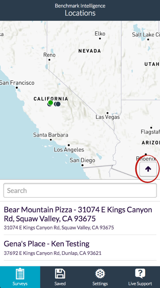
One example of adaptation while coding is on the location selection view. I originally designed the list to have a drag handle for modifying how much screen real estate it had, a pattern I borrowed from iOS's map application. I did attempt to implement this, but finding that reliably dragging it while making sure the map scaled appropriately (allowing the map's centering calculations to be accurate) was overly challenging, "janky" and more work than was necessary to simply get more of the list in view. So I adapted, abandoning the slider and using a button instead. This resulted in a faster, more explicit and simple user experience with much cleaner code.
Enhancing While Coding
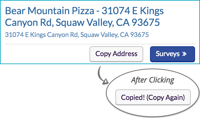
By saving time and opting for more simple implementations where the user experience wasn't sacrificed, simple features that weren't initially considered were able to make it into production. While interacting with the map and list it occurred to me that users might have a need to find directions to a location. Of course building navigation into this app's map would cost enormous amounts of time, so instead I added a button on the fly allowing users to copy a location's address with one click/tap. They can then easily take that address to a dedicated navigation app like Google Maps.
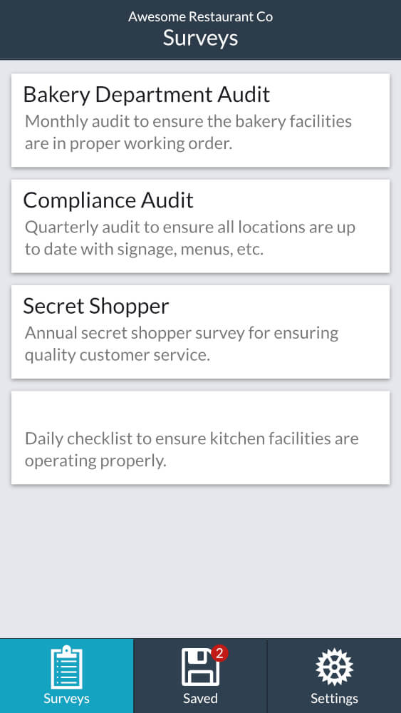
As a UI becomes "alive", actually interactive and you have the opportunity to play it, moderate adaptation on the fly is crucial for achieving the best results. On the survey list view, I originally designed simple selectable panels. However once I was able to interact with them and notice my raw impressions, I realized they didn't appear "clickable" like a link or button does. So I adapted, adding indication that the items bring you somewhere when clicked.
Filling in the Blanks
One more example of adapting on the fly, or in this case having to respond to an undesigned component that was defined in the "hit list" (an artifact of rapid designing), was I realized I needed to keep the user informed about their connection status and when survey progress was saved. This realization didn't occur until I was actually writing code for saving progress as the user entered survey responses. After some thought over coffee and a few sketches on a napkin, I added a status indicator to the "mast". When a user enters a response, their progress will save automatically and provide indication. If saving failed, a clear warning would be displayed that the user lost internet connection and the system would attempt to reconnect every 10 or so seconds.

Introducing the Benchmark Intelligence Field Audit App 2.0
Reflections
Small, agile startup development teams hold an advantage over enterprise level dev teams when it comes to speed of execution. This project took me about a month from the beginning of design to production ready app. I was able to achieve this because I understood the goal, I was in touch with our customers needs and was able to put my heart into it without too many stakeholders involvement.
This application was built with very modern web technology and is structured in a way that it can continue to grow and evolve through iterations. There were a few things I took away from the project as well...
- I Love Error/Success Messaging – Although it feels painful to grind through the various error and success flows in an app, there's also a strong sense of security and pride when it's done. Encountering them in a natural way when testing the app feels great as well.
- Extra Effort Grows Pride – Especially when building the location list UI with the map, developing all the interactions and symmetry between the map and the list was challenging and rewarding. The more I held myself to a higher standard, the more proud I was of the result.
- Developers Are Certainly Designers Too – Being able to take this build from design to production ready product allowed me to reflect a lot on the relationship between designers and developers. Having a fair bit of enterprise level experience, especially the times where I was on a design team sending work to separate development teams, I realize more than ever how many subtle interactions are nearly impossible to think of until actually developing. The only way to get a truly great user experience is if design and development are seen as a vignette with a high amount of overlap.